

CLIENT
the barlesstender

SCOPE
branding
packaging
stationery
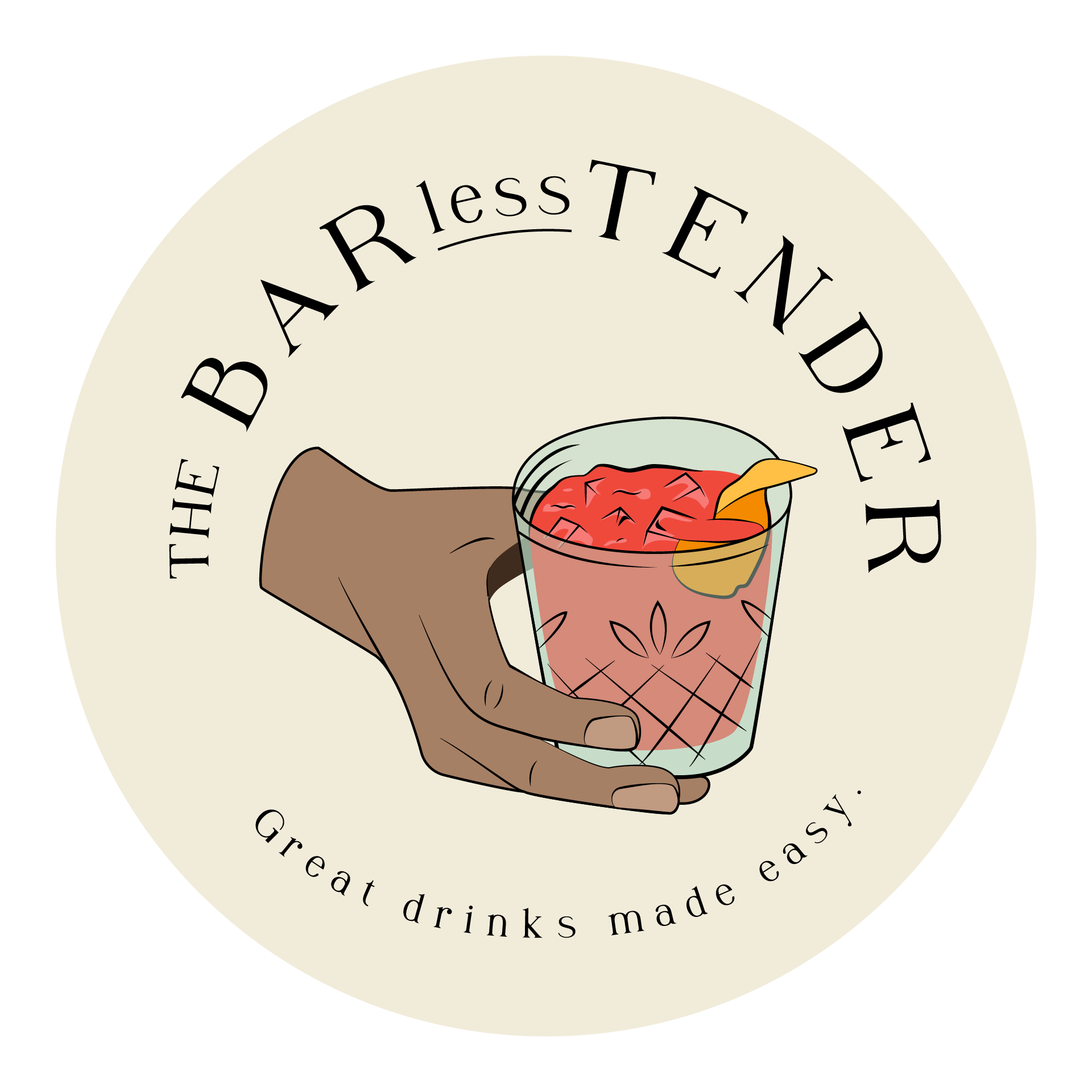
The Barlesstender aims to demystify some of the art behind the craft of bartending. They want to be the bridge between mixology and your home bar, showing you how to get the best use out of your bar tools or how to make due when you find yourself in a situation, lacking said tools.


AESTHETIC
relaxed
classy
friendly
sophisticated but not stuffy
The color palette is based in neutrals which allows for a sophisticated base and a variety of bright secondary colors allows the brand to tone up or town down the creative based on the setting. The Barlesstender is about creating a great drink easily so the creative should feel easy to consume, meaning simple and thoughtful.
